
Dal Fuori Salone e Salone, Milano 2026
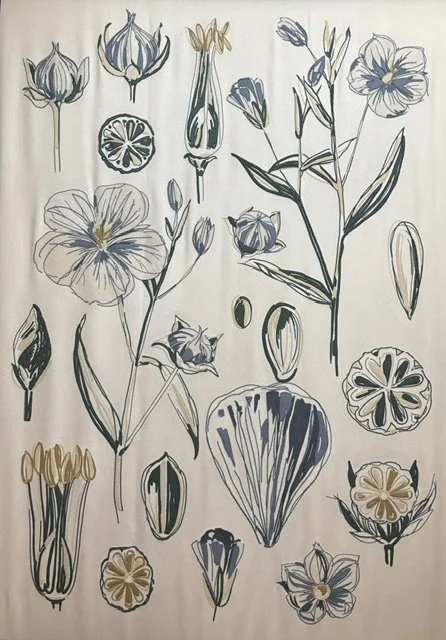


Nel plaid quasi un vocabolario botanico viene reinterpretato attraverso applicazione, ricamo, perline: passaggio dal disegno alla materia. Gesti ritmi e connotazioni che interpretano la visione Loro Piana. La linea dei fiori acquista spessore, peso e tattilità
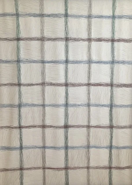
Da lontano sembra una semplice griglia. Avvicinandosi, ogni linea rivela una moltitudine di piccoli segni che generano movimento. Esiste una struttura resa viva da infinite micro-variazioni. È curioso come l’armonia non derivi dall’uniformità, ma dalla convivenza di piccole differenze.
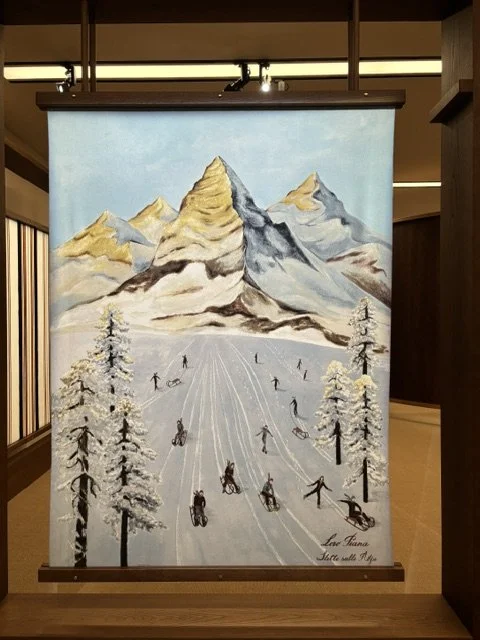
Mi piace questo ricordo di una cartolina mentale del freddo, perché parla di sensazione. La montagna non fa da sfondo, è la protagonista. Come certe illustrazioni dei libri di una volta. E forse il ‘lusso’ a volte, è proprio questo: farti sentire altrove per qualche istante, la possibilità di sentirsi bene anche nell’idea di essere piccoli dentro qualcosa di più grande, di un tempo lento e nostalgico.
Nel fuori salone l’esposizione di alcune interpretazioni da Taroni seta: dettagli geometrici di tessuto con il colore
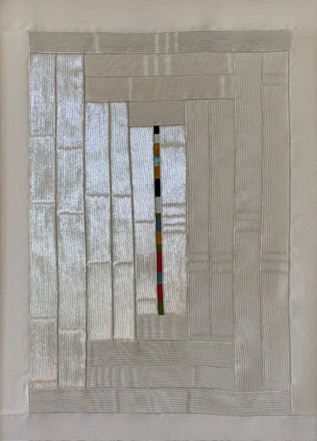
Il bianco/argento con la striscia cromatica è sofisticata! La struttura a riquadri concentrici in tessuto ribbed avorio/argento crea una geometria quasi architettonica, e la colonna di colori al centro funziona come un codice segreto
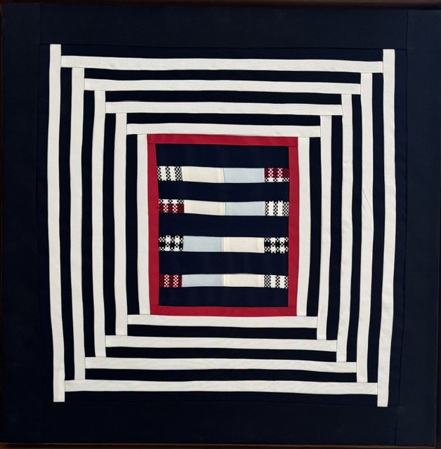
Il nero/bianco/rosso: immagine quasi sportiva nel codice visivo. Le righe concentriche creano un effetto tunnel ottico. Il rosso cardinale come frame interno rompe la tensione bianco-nero.
La geometria come struttura portante, il colore come rivelazione progressiva. Colore che emerge dalla costruzione del tessuto. Tensione tra ordine e sorpresa, tra la struttura tecnica e la scelta cromatica. La griglia multicolore su bianco, vicina al mondo della carta o stampa, una sorta di codice a barre cromatico.
Palazzo dei Giureconsulti con l’esposizione Olandese
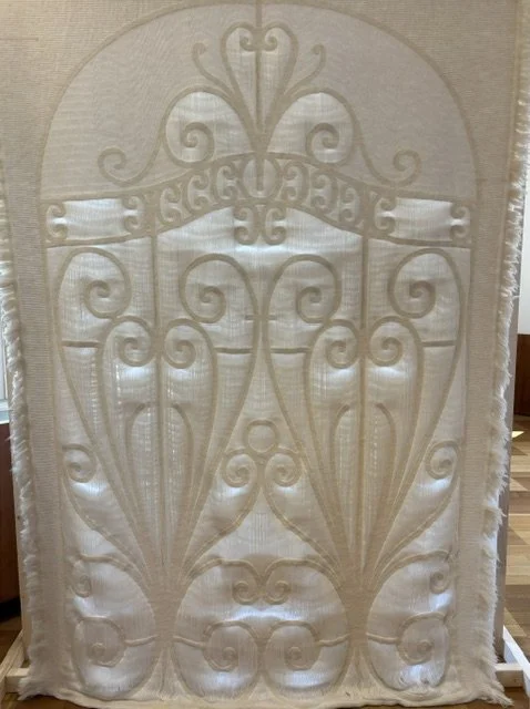
Una sorta di fusione tra il linguaggio Art Nouveau e un di una cancellata. Una applicazione tessile quasi scultorea tra il controllo del rilievo e la luce. La trasformazione di un motivo architettonico in materia tessile. Designer esperta nell’arte della tessitura: Victoire Shadé Coustilieres
Kerakoll Brera Studio
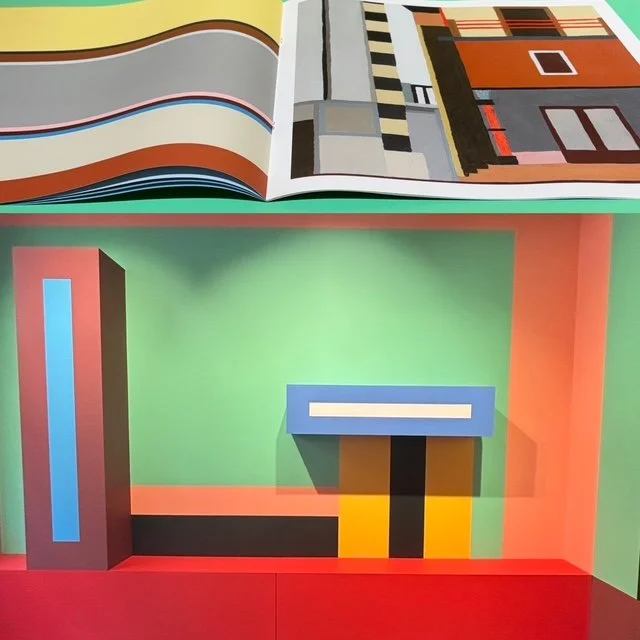
I colori costruiscono ambienti. Rimandano sia all’architettura razionalista che alla pittura anni ’60-’70. Logica geometrica: nessuna sfumatura, tutto è campo piatto e contrasto netto.
Plaid Hermès alla Pelota con il Fuori salone. Una foto collage di un’architettura tessile: ritmo, sospensione, materia, luce, bordo, colore dettaglio. Qui il plaid diventa pannello, una presenza murale in una distanza contemplativa.
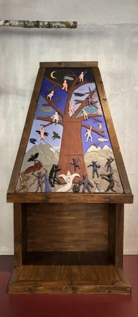
Il camino da Nilufar di Krampus, del designer Davide Monaldi. Una soglia fisica, psicologica, onirica. E’ un focolare che non scalda, un rito domestico trasformato in teatro. Le figure che si arrampicano sull’albero con le creature notturne. Un oggetto che dovrebbe contenere il fuoco mentre contiene un mondo diverso, con ciò che fa paura.
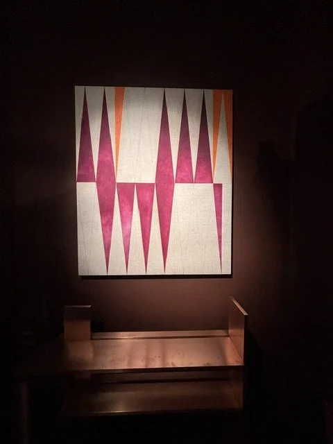
Il quadro porta ordine nella geometria rigorosa sulla tela grezza di lino naturale, negli acrilici opachi su disegni a mano .
Al SaloneSatellite: sperimentazione, materia povera, ironia progettuale e confine sfumato tra arte e design.
Poltrona:
•l’esperienza di una poltrona non solo nella “forma”
•il comfort non nell’imbottitura ma della percezione;
•il colore come gesto collettivo;
•il tessile che invade la struttura e ne addolcisce la brutalità
Sio Park rappresentato da una designer coreana.
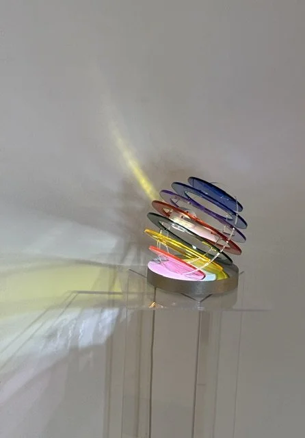
Una piccola lampada dove il colore muovendosi diventa un fenomeno luminoso e spaziale, un’installazione percettiva.
I cerchi colorati non si limitano all’oggetto ed “esplodono” sulle pareti, trasformando l’ambiente. La luce diventa materia mobile.
Trovo interessante il contrasto tra la struttura tecnico-geometrica e il risultato poetico, quasi cosmico @sio.park_
‘Memento’ è un pezzo di design concettuale, che trasforma il marmo di scarto in vasi per fiori singoli, con steli curvi in ottone e metallo nero.
Contrasto tra pesantezza e leggerezza, quasi un oggetto da meditazione sul tempo e sul valore.
Da Rossana Orlandi:
Il tappeto di Kiki van Eijk (Little House of Our Dreams, 92×115 cm) morbido, tattile, quasi infantile. Ma quella casina gialla con il tetto bordeaux fiorito è una casa che non esiste davvero, è una casa sognata. Il titolo lo dice senza ambiguità. È il rifugio che ci costruiamo nella testa.
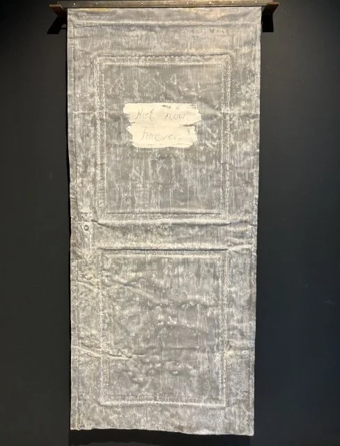
La porta fittizia che non si apre su qualcosa, appesa nel vuoto con quella scritta: ‘Not now. Forever’ ‘Non adesso’. Per sempre. Non è un rifiuto ma una promessa.
L’opera è in un calco in piombo realizzato a mano, Cengiz Hartmann
Figure agugliate: le linee non finiscono nella figura, la attraversano. La potenza di un filo che diventa forma.
La creatività è permettere a qualcosa di emergere. La figura è semplice, quasi infantile.
L’efficacia di un ricamo agugliato nell'effetto tridimensionale e sfumato.
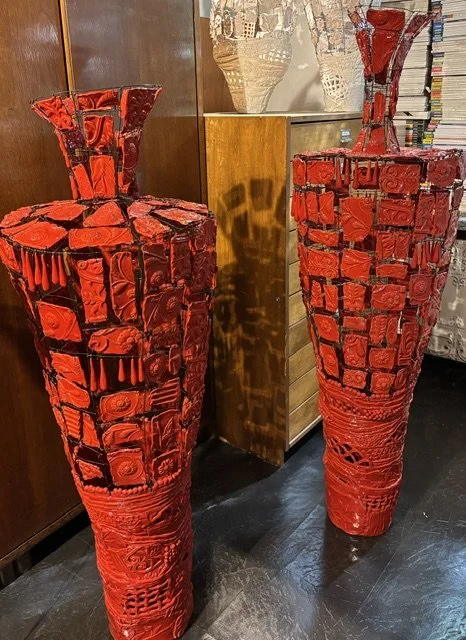
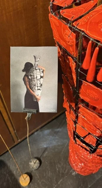
Il vaso porta energia quasi un vulcano di ceramica: archeologia mediterranea attraverso una ceramica brutalista a elementi in rilievo. Designer Chiara Berta
English
In the plaid, what is almost a botanical lexicon is reinterpreted through appliqué, embroidery and beading: a transition from design to fabric. Gestures, rhythms and connotations that interpret the Loro Piana vision. The line of the flowers takes on depth, weight and a tactile quality
From a distance, it looks like a simple grid. As you get closer, each line reveals a multitude of tiny marks that create a sense of movement. There is a structure brought to life by infinite micro-variations. It is curious how harmony does not stem from uniformity, but from the coexistence of small differences.
I like this memory of a mental postcard of the cold, because it speaks of a sensation. The mountain isn’t just a backdrop; it’s the main character. Like certain illustrations in old books. And perhaps ‘luxury’ is sometimes just this: making you feel as though you’re somewhere else for a few moments, the chance to feel at ease even in the idea of being small within something bigger, of a slow and nostalgic time.
At the off-site exhibition, a selection of designs from Taroni Seta is on display: geometric fabric details in colour
The white/silver design with the colour stripe is sophisticated! The concentric square pattern in ivory/silver ribbed fabric creates an almost architectural geometric effect, and the column of colours in the centre acts as a secret code
The black/white/red: an almost sporty image in the visual language. The concentric stripes create an optical tunnel effect. The cardinal red of the inner frame breaks up the tension between the black and white.
Geometry as a supporting structure, colour as a gradual revelation. Colour that emerges from the construction of the fabric. A tension between order and surprise, between the technical structure and the choice of colours. The multicoloured grid on a white background, reminiscent of the world of paper or print, a sort of chromatic barcode.
Palazzo dei Giureconsulti, featuring the Dutch exhibition
A sort of fusion between the Art Nouveau style and that of a gate. An almost sculptural textile design that balances relief and light. The transformation of an architectural motif into a textile. A designer skilled in the art of weaving: Victoire Shadé Coustilieres
Kerakoll Brera Studio
Colours shape spaces. They evoke both rationalist architecture and the painting of the 1960s and 1970s. Geometric logic: no nuances; everything is flat and sharply contrasted.
Throw Hermès at La Pelota during the Fuori Salone. A photo collage of textile architecture: rhythm, suspension, texture, light, edge, colour, detail. Here, the throw becomes a panel, a wall-mounted feature viewed from a contemplative distance.
The fireplace from Nilufar by Krampus, designed by Davide Monaldi. A physical, psychological and dreamlike threshold. It is a hearth that does not give off heat, a domestic ritual transformed into theatre. The figures climbing the tree alongside the nocturnal creatures. An object that is meant to contain fire, yet holds a different world within it – one filled with what frightens us.
The painting brings order to the rigorous geometry on the raw natural linen canvas, in matt acrylics applied over hand-drawn sketches.
At the SaloneSatellite: experimentation, humble materials, playful design and a blurred line between art and design.
Armchair:
•the experience of an armchair, not just in terms of its ‘form’
•comfort not in the padding but in the way it feels;
•colour as a collective act;
•the textiles that permeate the structure and soften its harshness
Sio Park represented by a Korean designer.
A small lamp in which colour, as it moves, becomes a luminous and spatial phenomenon – a perceptual installation. The coloured circles are not confined to the object but ‘explode’ onto the walls, transforming the space. Light becomes a fluid substance. I find the contrast between the technical, geometric structure and the poetic, almost cosmic result fascinating @sio.park_
‘Memento’ is a piece of conceptual design that transforms waste marble into vases for single flowers, featuring curved stems made of brass and black metal. A contrast between heaviness and lightness, almost an object for reflection on time and value.
From Rossana Orlandi:
The rug by Kiki van Eijk (Little House of Our Dreams, 92×115 cm) is soft, tactile, almost childlike. But that little yellow house with its burgundy roof covered in flowers is a house that doesn’t really exist; it is a house of the imagination. The title makes this perfectly clear. It is the refuge we build for ourselves in our minds.
The fictitious door that doesn’t open onto anything, suspended in mid-air with the words: ‘Not now. Forever’. It is not a refusal but a promise. The work is a hand-made lead cast, Cengiz Hartmann
Needle-like shapes: the lines do not end within the shape, but pass through it. The power of a thread that becomes form. Creativity is about allowing something to emerge. The figure is simple, almost childlike. The effectiveness of needlepoint embroidery lies in its three-dimensional and nuanced effect.
The vase radiates energy, almost like a ceramic volcano: Mediterranean archaeology interpreted through a brutalist ceramic piece featuring relief elements. Designer Chiara Berta