
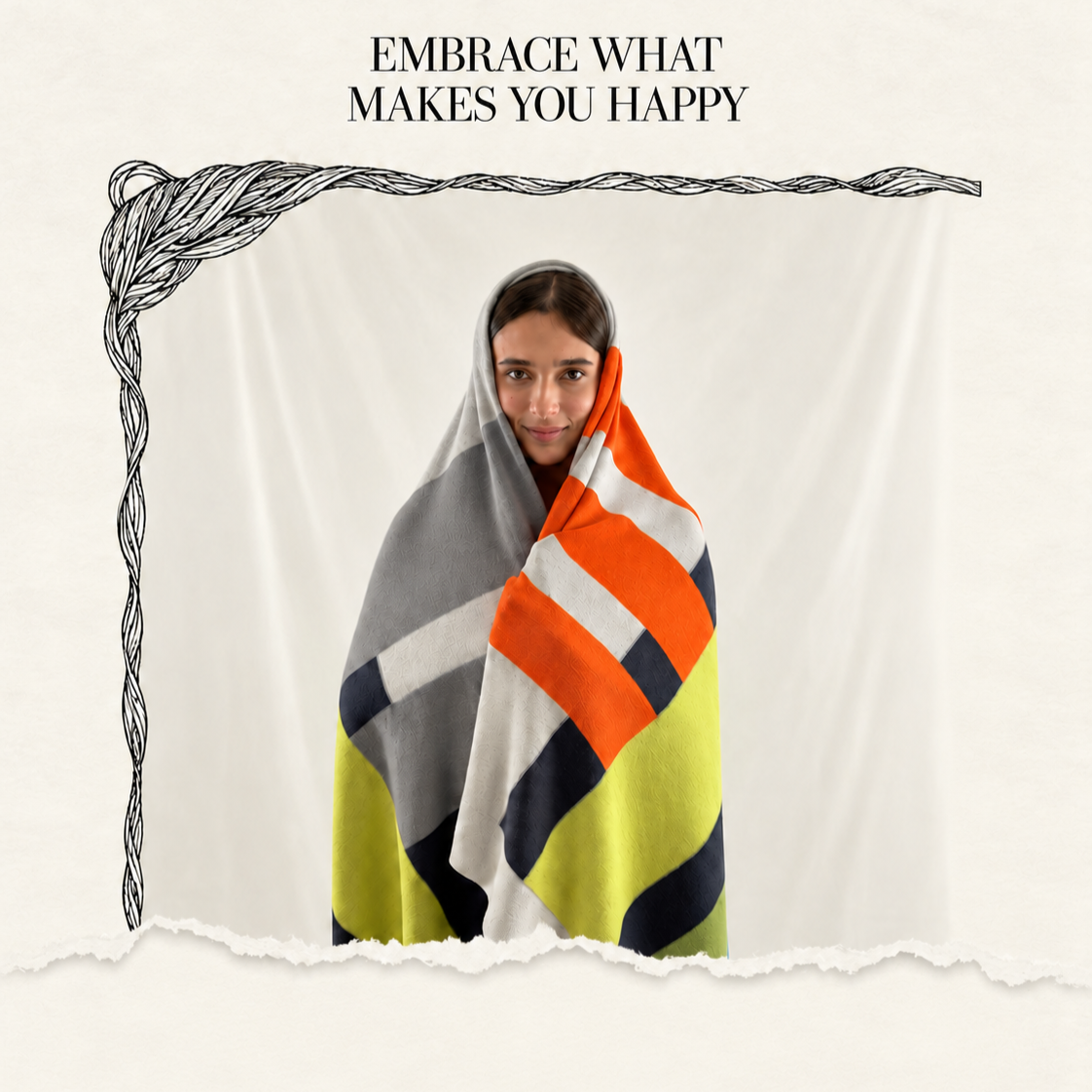
Certi abbracci hanno buon senso nel colore.
Colore, materia e disegno: il mio modo di
pensare il complemento tessile
comincia qui.
Come ti presenti a chi ti incontra per la prima volta?
Sono un peso calcolato: quello giusto per farsi sentire e non pesare. Oltre al colore sono ‘complice’ di una densità: quanta lana per centimetro quadro, quanto vuoto tra un punto e l’altro. Il resto viene dopo.
Per il prossimo autunno-inverno: che colori e texture porti in primo piano?
Terre bruciate chiare ed intense con verdi muschio; un rosso ossido che compare solo nei dettagli, nel bordo o una frangia.
La texture si fa più materica: intarsi che imitano la corteccia, jacquard con rilievi, mano più voluminosa ma morbida al contatto. L’idea è la stratificazione, come il sottobosco a novembre.
E se dovessi scegliere solo due colori per l’inverno vero e proprio?
Grafite e crema. Il primo assorbe la luce delle giornate corte, il secondo la restituisce. Insieme in silenzio, entrambi non chiedono attenzione e, proprio per questo la ottengono.
Il comfort per te cambia tra le due stagioni, o è lo stesso obiettivo declinato in due modi?
È lo stesso obiettivo. In autunno il comfort è transizione, un peso medio che accompagna il cambio di luce, si tiene sulle ginocchia più che addosso. In inverno diventa rifugio, calore che non si disperde, qualcosa che accoglie e copre invece di posarsi.
Un motto, se dovessi lasciarne uno.
Resto dove mi lasci. Non seguo, non anticipo, sto ferma nel punto in cui qualcuno ha deciso di fermarsi.
Ultima domanda: per quali momenti esisti davvero?
Per quelli senza uno scopo dichiarato. Servo a restare seduti o sdraiati un po’ più a lungo di quanto si era previsto.
Interview with the blanket
How do you introduce yourself to people you’re meeting for the first time?
I am a calculated weight: just the right amount to make my presence felt without being a burden. As well as colour, I am ‘part of’ a density: how much wool per square centimetre, how much space between one stitch and the next. The rest comes later.
For the coming autumn-winter season: which colours and textures are you highlighting?
Light and intense burnt earth tones with mossy greens; an oxide red that appears only in the details, along the edge or in a fringe.
The texture becomes more tactile: inlays that mimic bark, jacquard with raised patterns, a fabric that feels fuller yet soft to the touch. The idea is layering, like the undergrowth in November.
What if I had to choose just two colours for the heart of winter?
Graphite and cream. The former absorbs the light of the short days; the latter reflects it. Together in silence, neither demands attention, and yet, precisely for this reason, they command it.
Does your idea of comfort differ between the two seasons, or is it the same concept expressed in two different ways?
It’s the same aim. In autumn, comfort is a state of transition, a light weight that accompanies the changing light; it rests on your lap rather than on your body. In winter, it becomes a refuge, warmth that doesn’t escape, something that envelops and covers rather than simply resting on you.
A motto, if I had to come up with one.
I stay where you leave me. I don’t follow, I don’t go ahead, I stay put where someone has decided to stop.
One last question: for which moments do you truly exist?
For those without a specific purpose. They’re useful for sitting or lying down for a little longer than you’d planned.
